Local Eats
Magazine Layout

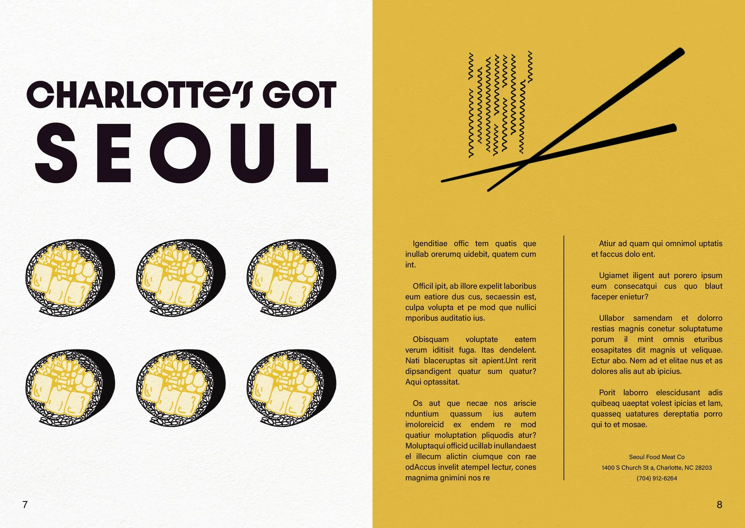
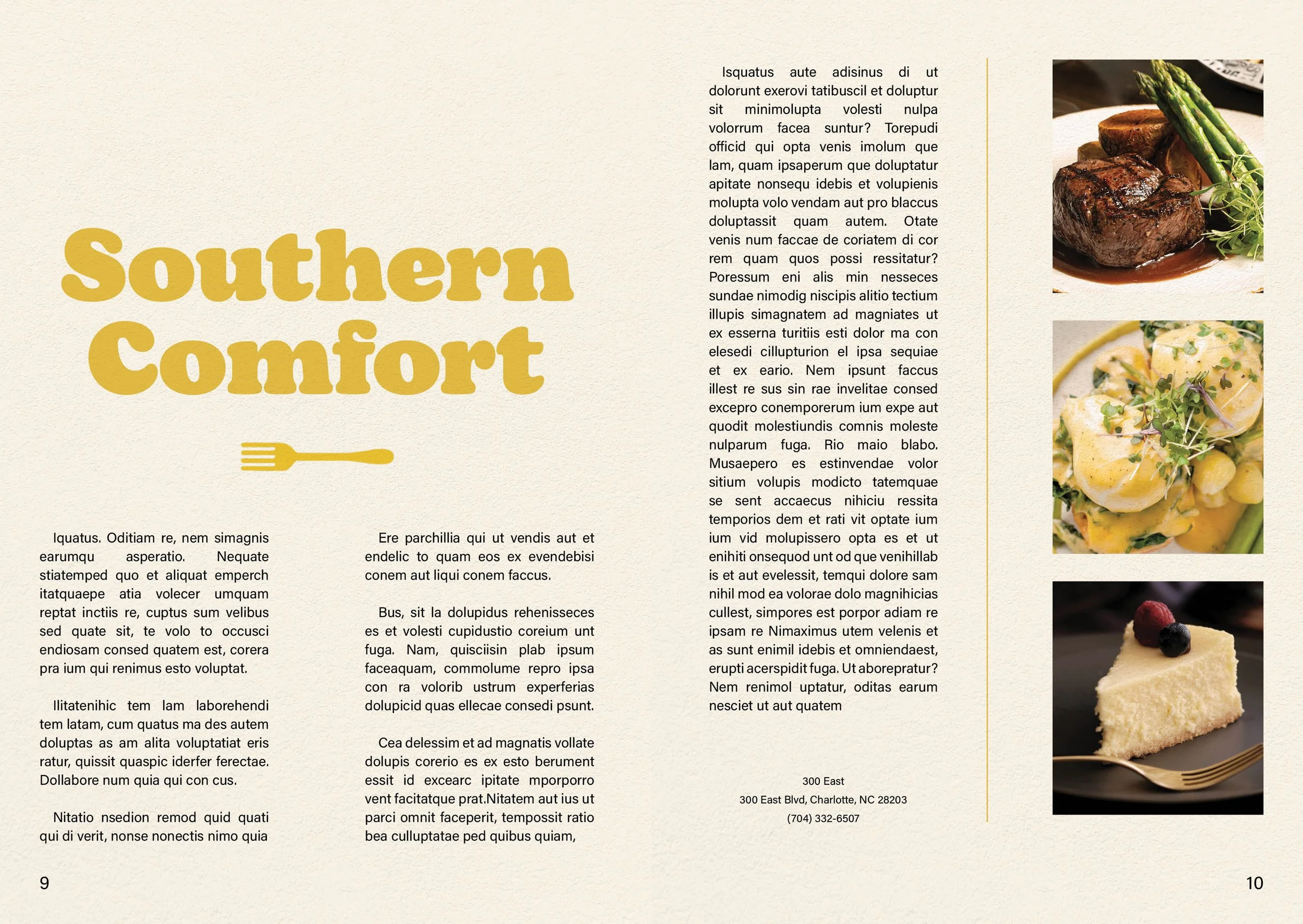
The goal of this project was to design a short magazine focused on restaurants in your hometown. I created illustrations, edited in Photoshop, and completed the final layout in InDesign.
I considered several things when choosing this color palette. For the warm colors I felt that red and yellow had the strongest connection to food - red is a known appetite stimulant and the mustard yellow added a nice, subtle highlight. I wanted a Carolina blue to pay tribute to the state, but the lighter hue didn’t work as well as this slightly deeper denim color. Black and white felt too harsh for the retro vibe I wanted to create with this magazine so I substituted with navy and cream for many of my backgrounds.


I wanted a mix of really fun typography in this magazine because I feel that so many publications lack variety in this area. The bulk of the text is an easy-to-read sans serif, but the article titles are a bit wilder. For consistency, some of the typefaces repeat on multiple pages.


Even the exterior covers are a blue-black hue rather than stark black to give the overall magazine a softer feel.


